When first starting, I received a warm welcome, getting an introduction to Visma, the company visions and the UX processes practiced here. I got two dedicated supervisors, Christina Freyhult and Johan Strandell as well as a supportive product owner, Atle Myhrer, who helped me during the entire project. Before I arrived, they had structured the project I was going to work on and specified expected outcomes, all to ensure that I would experience a complete design process during my time at Visma.

Example of wireframes that I did for the project
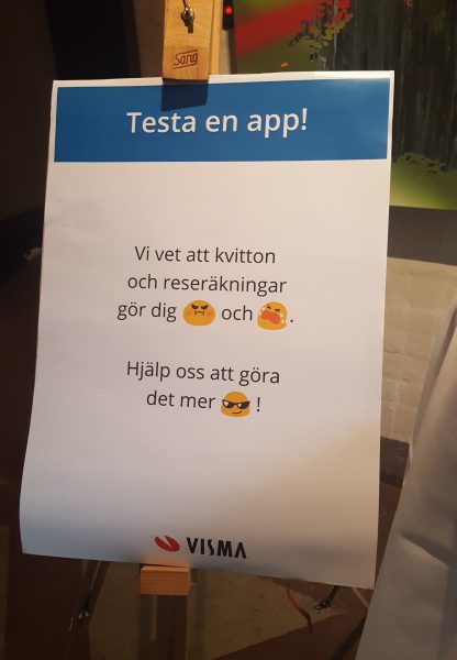
During my first week, I was thrown in head first to conduct internal user interviews. Back then it felt scary but in hindsight I’m grateful. During the project, I got to conduct around 40 interviews with both internal and external users. The interviews helped me define key use cases for a mobile version of Visma.net Expense, such as fulfilling the users need to collect data during trips and being able to complete their expenses and sending them for approval on the go. This information was taken into consideration during the design process, built into prototypes and tested with around 30 users internally and externally.The tests helped me identify which parts of Expense should be included in a mobile version. The most interesting finding was that some parts, such as trips and allowance, should not be included. Initially there was an “all or nothing” mindset towards Mobile Expense, but a mobile interface didn’t solve the issues of complexity regarding trips and allowance, which was the real issue users had with it.
Another vital finding was that users widely enjoyed using the mobile application ‘Attach’ (an application to take photos of your expenses and send to the ERP-system) but wanted more from their experience. The conclusion was to add additional functionality to Attach, turning it into Mobile Expense and a way of reporting expenses that meet the user expectations.

It does not have to be boring and stale to work with administrative software. It can be cool too 🙂
During my time at Visma I developed my interview skills, learned new ways of brainstorming and documenting, as well as new effective ways of prototyping. I got to take part of all activities and meetings together with other UX:ers, which quickly gave me an overview of work practices as well as a feeling of being part of the team.What strikes me the most about my internship experience is the amount of freedom I was allowed and the amount of responsibilities I was trusted with. I felt I was both a student and a co-worker, which has made me grow both personally and professionally. Doing my internship at Visma was overall a great learning experience. I not only recommend students to do internships, but to do them at Visma!

