With the ever-growing library of apps and the spreading of services (both private and public sector) to phones, the demand for extending our own Visma services has been there for a few years.
Here is a glimpse of the work that has been done on the Visma.net Expense platform to date, and some reflections on what has worked well (and not so well).
When planning the functionality to be made available on the phone, the work was intentionally divided into distinct steps so that releases could come more frequently, allowing earlier feedback and smaller releases.
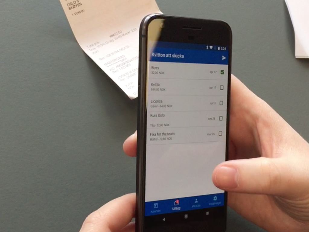
Agile, instead of waterfall. The plan was originally in three tiers. First: only viewing your existing claims. Second: using the Attach app to input receipts that the Employee app would display and allow users to select, edit and send. Third: calling on (or embedding) Attach so that all steps of adding a receipt could be handled from Employee.
This plan was slightly modified as design for the screens progressed, as it was deemed that users would not want to input the more advanced receipts and would be satisfied with performing the simplest of flows. As of September 2018, the mobile plan for Expense is now a 5 step process where step 3 is ongoing.


