This article is part of our blog series “Built for Growth”, where we explore Visma’s Group-wide services, the specialised working groups that help our companies succeed. By offering centralised expertise in core business areas – such as sales and go-to-market strategy, product development, finance, operations, HR, marketing and branding, customer success, security, and legal matters – we help our companies achieve more at less cost, while having fun in the process!
Visma is composed of several hundred companies, each striving to produce the best products in their local markets. By being part of the Visma Group of companies, they have access to resources and expertise that can help them further innovate and grow.
One business area Visma excels at is branding, which is vital for any company. A strong and cohesive brand unites a business around a common goal, making its purpose clearer and more compelling to customers, building internal pride, increasing customer satisfaction, and boosting revenue.
The branding team at Visma’s Group level works with our companies to identify challenges and redefine brand identities to achieve long-term growth. They get to work with some of the most innovative software brands in Europe, combining passion for design with the knowledge that the end result has a major impact on both customers and colleagues.
Rebranding a market leader
A leading Visma company in Sweden, Inyett provides an essential solution within payments: peace of mind. Thanks to the company’s Fintech software, municipalities, public authorities, and private companies can be confident that the suppliers they do business with have been vetted and verified as trustworthy.
In 2023, Inyett approached Visma’s Group branding team to help refine and clarify the purpose of their brand. According to one key member of the project team:
We’ve lost the startup vibe. We were more self-assured in the beginning and took more risks. We went from a maverick attitude to a more serious tone and lost sight of our identity. Now, we need to regain our confidence. It’s great that we’re now more mature and thoughtful, but we need to rediscover our passion while developing a newfound assurance. We must establish a new brand that aligns with our position as market leaders and pioneers of innovation.
It was clear that focusing only on the logo or colour scheme was not going to give Inyett the results they were after. By focusing solely on the visual parts of their identity, they risked missing out on the opportunity to build a more solid foundation for growth. Evaluating the identity as a whole enabled the organisation to work towards a common goal, gaining a sense of pride and confidence, which could lead to happier customers and increased revenue.
The old web presence looked like this:
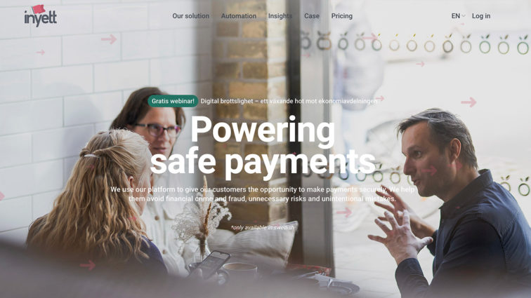
Because Inyett wished to create a new and commonly understood brand purpose internally, the branding team agreed to produce a written brand manifesto, which also helped determine if modifying the visual identity was necessary.
Research and brand manifesto
During the research phase, the team involved various employees to gather insights from different focus areas and viewpoints. They also researched the industry at large, including competitor analysis, to understand the most important factors to stay competitive. Their findings confirmed that Inyett needed a clearer purpose, a central part of the brand identity, both inside and outside the organisation. The team also realised that the brand’s expression and communication needed to be clearer, simpler, and more confident, while evoking a stronger sense of calm and safety. Lastly, the rebranding needed a clear connection to Inyett’s previous brand identity to maintain the awareness Inyett had built over the years.
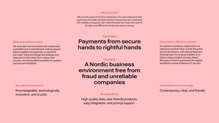
Armed with these research findings, the branding team began creating a new identity. First, they crafted a brand manifesto, a statement outlining the brand’s purpose and the basis for how this should resonate with Inyett’s core audience. The manifesto served as inspiration and as a starting point for various deliverables, not just for advertising and design, but also in product development and recruitment.
Here are the core statements from Inyett’s brand manifesto:
Reviewing the old visual identity
With the brand manifesto completed, the design team now had a research-based foundation to assess the existing visual identity. To maintain a connection with the previous identity and ensure that customers could easily identify the brand, the team opted to retain the metaphor of the red flag. But, they refined the logo to project a more modern and clearer brand image and enhance the overall cohesiveness of the logo design.
Here was the previous logo:

Here is the new logo:

The new logo benefits from an enhanced clarity and distinctiveness. The design of the red flag is also simplified, while the word mark now has a cleaner sans-serif font.
The branding team used the Google font Roboto as a foundation, with certain modifications. They eliminated the curved lines in the letters “y” and “t” to align with the shape of the flag icon. They also merged the double “t”s to subtly imply a gate, echoing the meaning of the second part of the name, “yett”, which translates to “gate” in English.
A new visual identity toolkit
In addition to redesigning the logo, the branding team also updated the rest of the visual identity for better brand recognition, communication of values, and differentiation from competitors.
Typography
First released in 2011, Roboto is a highly popular Google font that served as the main typography in the previous Inyett brand identity. In 2022, Google launched Roboto Flex, a “variable” font. This font allows users to customise its appearance by adjusting weight, slant, width, height, and other variables. The branding team chose to continue using Roboto Flex as the primary font for the sake of continuity and because of its flexibility. The font’s variable settings also allow headers and large text to gain a distinct look, which is an important brand element.
Colours
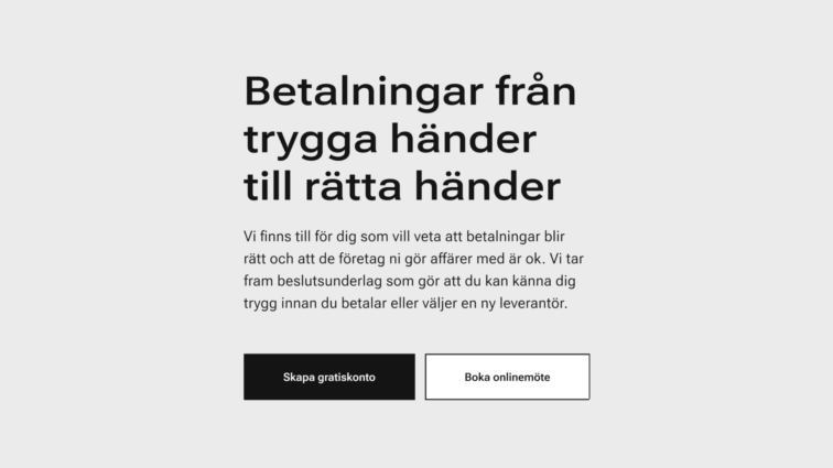
The decision to keep the red flag meant that red would continue to be one of Inyett’s brand colours. However, to prevent it from appearing too strong and aggressive, it is only used in the flag symbol and in details and highlights. The branding team chose a soft pink colour for the brand to establish a trustworthy and approachable image within Fintech.

Graphic elements
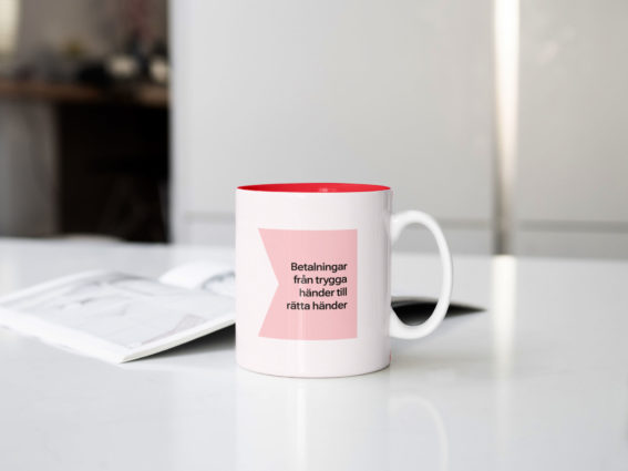
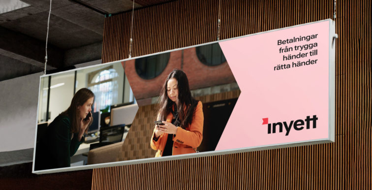
Finally, the flag has become a more versatile graphic element that adapts to different formats and content, and can contain colour, text, and/or images.

A new brand to rally around
The project involved conducting research, creating the modernised brand platform, and crafting a new visual identity toolkit. The new logo and visual identity were made to enhance clarity, distinctiveness, and brand recognition.
The end result was a refreshed brand identity designed to maintain Inyett’s position as the Swedish market leader in safe payments. Not only did Inyett gain better strategic alignment internally, but they also created a stronger organisational focus on delivering customer value. In addition, employees’ pride in the brand increased and they became more active brand ambassadors. This was reflected in a steep rise in eNPS scores for both engagement (17-point increase) and satisfaction (6-point increase).
View the Style Guide (text in Swedish) to see all the elements of the new visual identity. Watch a two-minute video summarising the rebranding effort.
Want to learn more about how it is to work with branding at Visma?
Are you a software entrepreneur wanting to join the SaaS software revolution?

