Since it was first run in 2012, the goal of the UX Mentor program has been to give the participants (often developers, business analysts and service owners) knowledge, tools and competence to work according to the user-centred design process. This blog post is written by Jorid and Armands, two of the participants of this years program.
The goal of the UX Mentor program
Apart from gaining a new perspective and learning a new way of working, there are some concrete goals with the UX Mentor program. At the end of the program, the participants should have practical experience of using user-centred design methods on their own, and have basic knowledge of design theory. Each participant should be able to analyse user needs, do basic user tests, create user interfaces that follow best practices and evaluate existing interfaces.
To get to that point, the participants part-take in lectures, read books and most importantly, meet with users to complete different tasks, such as testing a prototype that they themselves have created for something that they need feedback on in their product. On top of that, they meet weekly with their mentors to discuss and reflect on what they have done and learned.
“The most important thing has been that we have been able to call and visit real customers to try out what we have learned.” – Armands Ķirītis
It is easy to spot good design if it’s in interior, outdoor clothing, cars or an app that quickly becomes a favourite. But why does it become a favourite? Is it the colour? The layout? We copy parts of the product, and get disappointed when the effect does not meet our expectations. Why?
I have learnt that good user experience is when a tool feels natural to use to solve your mission. We are constantly on a mission, and of course we feel better if we feel like we are on top of the situation and make progress. In software we tend to give the user feedback like “user name and password do not match” or “invalid date”. Is this the best way of helping the user gain progress? What if we changed it to “Try again, you need to enter matching username and password.” and “Enter a valid upcoming date”? Not a big change, but we put the user in a state where they can influence their progress.
Before starting the UX Mentor program, I expected to get a good introduction to Visma’s design language “Nordic Cool”, but instead I got the tools to ask the right questions that should be answered by a well designed service or app. I also learned that “well designed” does not only mean good looking, but should give the user the feeling that our applications support their mission. Luckily, good user experience often tend to lead to good looking software. A well thought-out use of colours, grouping and visual hierarchy is often a good way of getting the right things in focus.
As a software programmer I know SOLID, a set of mindsets, tools and ideas to create good expendable and maintainable code. I feel like this mentorship program offers a similar package for getting good, expendable and maintainable user experience. In an ideal world we would always start from scratch, but just as the SOLID principles, the principles of UX can be used on a daily basis to make sure we always leave a page with a better user experience than when we started working on it. This mindset is the biggest thing I take with me from this experience.
What it actually gave us
As Jorid already wrote, the program has given us a lot of tools to ask the right questions. I have always been into UX, following trends, reading articles and participating in the UX Riga conference since it was first held here in Latvia. The UX Mentor program has given me more practical insights into the things I previously mostly read about. There were things I had tried in my previous project where we didn’t have a dedicated UX role, but here it has been taken to a whole new level.
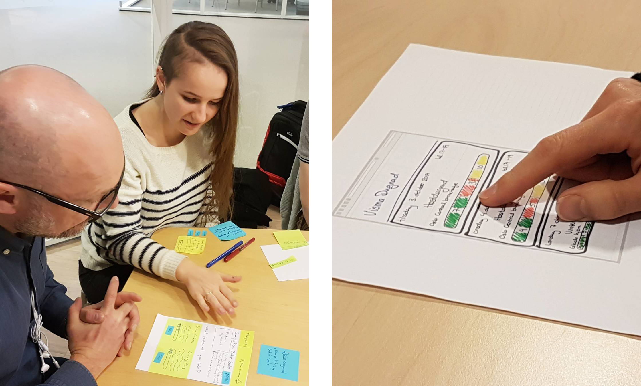
In my opinion, the best part of the program has been the meetups. In the beginning we had a introductory meetup where we got to know each other, got an introduction to UX and even got to try some methods such as paper prototyping, interviews and usability testing with Visma colleagues.

One of the participants, Vaida, testing out a paper prototype on a mentor before testing with users.
The second meetup took place a few weeks ago, as we are getting close to the end of the program. At that point all of us were more knowledgeable from the common sessions and day to day work, so it was more dedicated to practical work.
The most important thing has been that we have been able to call and visit real customers to try out what we have learned. As part of the second meetup, we visited a customer who doesn’t use the payroll product that I am working on, so we could check how they interacted with our solution. A lot of new insights came out of it, and it wasn’t only helpful for me as a business analyst to understand – but it will also be communicated to my team and implemented as improvements. The most important thing I take with me from this experience is that I can keep working like this to improve our solution.
About the authors

Jorid Opsahl
Jorid has a BEng in Computer Science and about 13 year of experience in software development. She works as a Software Developer (now with a growing interest in UX) in one of the Visma Gat teams, with special attention to their new app GatGo and the calculator engine that continuously warns employers if an employee violates the work hour requirements in the Work Environment Act.

Armands Ķirītis
Armands has a MSc in Computer Science and over 9 years of experience in business analysis. He works as a Product Business Analyst (BA) in the Visma.net HRM Employee Management UI team, where he works closely with UX designers to create the best user experience for the customers.

