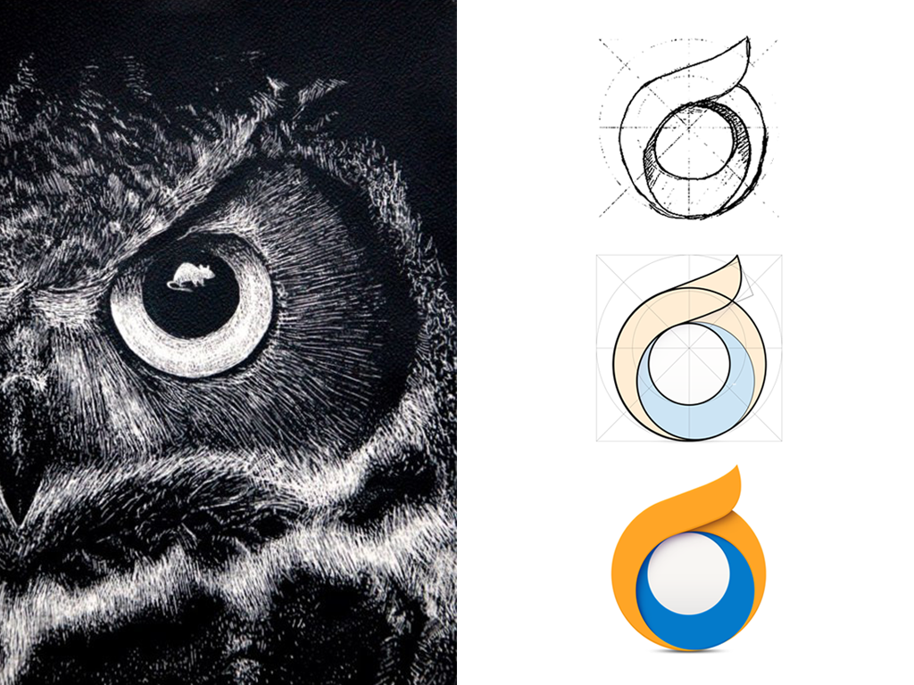
My work process
I am a Graphic Designer with more than 10 years of experience in Visma, focusing on everything from branding materials, designing applications, user interfaces, websites and video animations.
Recently, I’ve been working on cloud icons that have been developed for navigation purposes in online solutions such as Visma.net and Visma Online. I often get asked how I create icons for complex applications, and what my work process looks like. Therefore, I have decided to share some of my thoughts on the process of designing our product and service icons.
I want to start by saying that it is very important to understand the requirements, knowing what to accomplish, and, finally, to collect the keywords that help me generate ideas and incorporate them into the icon. However, it’s not always that simple.
Finding the right metaphor can be challenging, especially when dealing with applications with complex use and applications that consist of many tools. The main goal is not to explain the functionality of the entire product or service, but rather creating visuals that require little explanation and that acts as a visual cue for the user.
When we updated our design language Nordic Cool to its latest version, NordicCool 3, we chose to move towards almost flat design, and tend to design for more literal meaning when possible. However, there are cases when I have to find metaphors that are detached from physical objects, and instead, express something related to ex. our state of mind, emotions, growth, cooperation or performance. Some of these more abstract ideas help me to still incorporate what is necessary.
Here is an example of a more literal icon profile that I created for the administration system Visma InSchool, where the goal was to find a visual representation that everyone including administrative staff, students and teachers, could relate to:
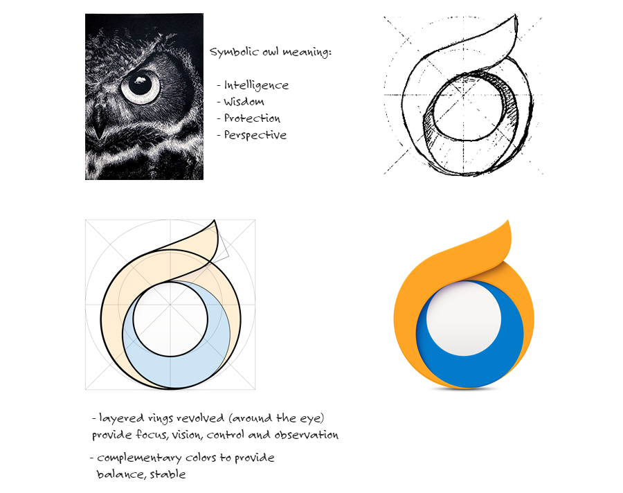
How this works in practice
For me, each icon design should start on paper and then move into the computer, as a second stage. This might seem a little old-fashioned, but it allows me to save time when sketching ideas and thereby lets me find promising directions faster.
The next step is to create the digital elements and to go further into details, exploring colours. We have worked hard and paid extra attention to standardizing the geometrical and organic shapes, to help groups of icons feel consistent, like they are a family. Furthermore, the colours must be aligned with the brand strategy, and used in a manner where they provide a friendly, balanced and positive tone.
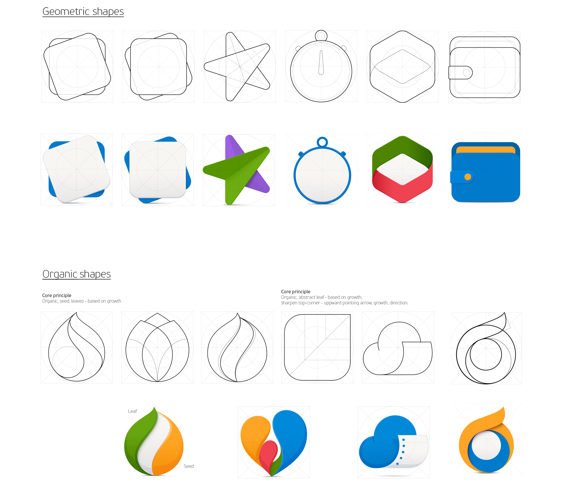
Examples of geometrical and organic shapes.
In addition, I like to involve the use of physical properties. For instance, I love to give the icons a more natural look by adding light. The light allows the object to cast shadows, which generates depth and results in making the icon feel touchable. Magic!
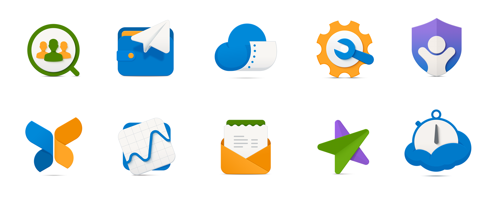
An example of an icon family.
By now we have come a long way, but the process does not end just yet. We need to do test the icons to see if they convey what we want them to. Based on the results, we often need to do several iterations and adjustments and test again to really make sure that the icons work well in their context.
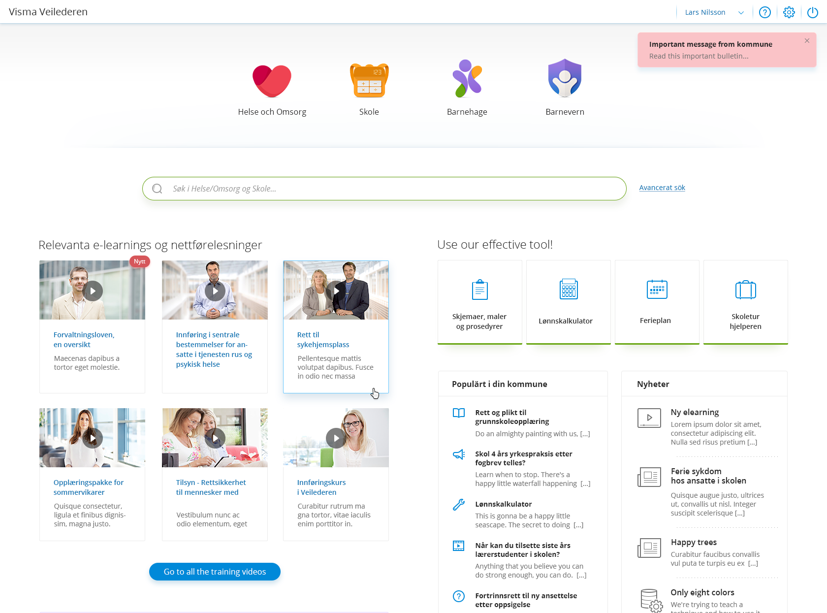
Part of an icon family in their context.
Some things I have learned over the years
Design is an area in which learning is a continuous process. Trends and technology are constantly changing. They evolve and we, as designers, have to keep up with them. Over the years, I have learned that communication and constructive feedback is absolutely vital. We need to be open to alternative solutions and suggestions. Design is not just about creating well crafted images. It should serve a specific purpose.
Just as anyone else, I sometimes need inspiration in my work and that is OK and something we should allow ourselves to develop. I have collected a few resources that I like to use when I want to get inspired:
- Google – the first place I look to for answering my questions.
- Behance – an online platform to showcase and discover creative work.
- Designing Brand Identity by Alina Wheeler – a great book for those who are interested in visual identity development.
- Dribbble – an online platform for designers.
- Pinterest – an online pin board for collecting ideas.
- Smashing Magazine – a magazine with sections dedicated to designers where you can find interesting ideas.
Last but not least, I like to find inspiration in nature and by talking to my talented colleagues.

