Norway’s new electronic health record
This article is part of a series of articles we have written about the development of the Norwegian municipalities’ new patient record, Visma Flyt Health Care. You can read the other articles in the series here (in Norwegian):
- Kommune-Norge needs a new patient record now
- IT security and privacy in the journal system of the future
- Structured documentation with ICNP
UX is the abbreviation for User Experience. The goal of a UX Designer is to design a solution that gives the user easy access to the information and functionality needed to perform their job in an efficient, safe and secure manner. In addition, structured data shall be used as much as possible as it contributes to thoughtful decision making processes in the municipalities.
Henry Ford said, “If I had asked people what they wanted, they would have answered faster horses.”
An important principle in UX design is not to design for the users, but with the users. This means that the UX Designer does not ask the users what they want and design based on the answers, but maps out the underlying needs and solves them in collaboration with the users. “Why” is therefore the most important question a UX Designer can ask to create a solution for the users and the future.
When we are to develop the future EHR solution for Norwegian municipalities, we must be clear about the fact that a “one size fits all” solution will not work. The different roles within healthcare have very different needs, and we must structure information and functionality so that we give them what they need, when they need it. In addition to the Norwegian Directorate of eHealth (NDE) a.k.a. Normen, we must also facilitate universal design, and we cooperate with the business side so that their wishes and goals are taken into consideration.
User-Centered Design

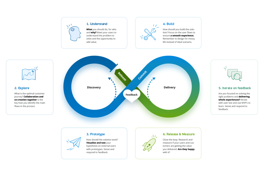
At Visma, we work according to the Visma UX Value loop – a user-centered design process. This means that user experience is our starting point, how does it look and how useful and safe does it feel to use it? We must ensure that we deliver solutions that provide a clear value and that meet users’ expectations and needs. To do that, we need to know our users really well and understand their needs.
1. Understand
What is the context? In other words, what should you design, for whom and why?
During this phase, it is important to meet the users to discover and understand what needs and problems the EHR should solve, and, in addition, what can be done to deliver something that provides added value.
Before the development of the new EHR, Visma Flyt Health Care, started, the UX team spent a lot of time mapping out the work processes of future users of the system. This was done through user observations and interviews in small and large municipalities across the country.
In addition, the current system was mapped out with regard to functionality, information structure and roles/professions and their processes. A lot of work was done to find an improved structure that provided easy access to the most used elements for the majority of the users.

2. Explore
How does the functionality and processes work in the optimal customer journey? What are the most important elements and what will the optimal customer journey be like for the various users?
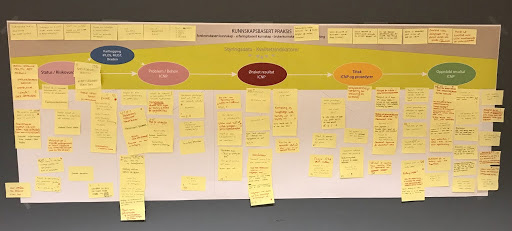
We can find answers and solutions to these questions in several ways. During this phase, we work internally in the development team, in collaboration with consultants and together with the users. We use concept sketches, various mapping methods and workshops. In this way, we come up with as many ideas as possible.

3. Design and prototype
The third step is to visualize the selected processes and functionality in a way that allows for the concepts to be tested with users. Which concepts will best meet the needs of the users? What should be prioritized, and where should compromises be made?
The design process takes place in several iterations, and the feedback from the tests can often lead to the design being re-evaluated and small changes being made. The design processes take place on many levels throughout the development process. We start with an overall plan for how the structure and flow should be in the application, but we must also look at the details of each process and functionality in the same way.
4. Build and iterate
Analysis, design, testing and development takes place in parallel in Visma Flyt Health Care. It is said that “The devil is in the detail” and it is important that UX is actively involved in the detailed description of what is to be developed. For example, are there technological limitations or possibilities that mean something should be adjusted in the process or design?
In the same way, the UX Designer tests everything before it is put into production. Have all the details been included and does it work as intended?
5. Release and measure
Visma Flyt Health Care should be a good work tool for users within Norwegian healthcare. How do we know that the end-user is happy with the functionality and intended use of the application?
In Flyt Health Care, it is the user experience over time that is important and that will be measured and tested. Does it work as intended? Does it meet the end user’s needs? These are questions that we do not yet know the answers to, but it is something we must look at and develop as more municipalities use the solution over longer periods of time.
Finally, we would like to thank all of our customers who contribute to the development of Flyt Health Care. Together with you, we will develop a new generation of electronic health records.

