“A modern paradox is that it’s simpler to create complex interfaces because it’s so complex to simplify them” – Pär Almqvist
Often good user experience ends with this sentence, simply because the good user experience is perceived to be too complex to achieve. But today, virtually all products and services have ease of use, intuitive or “good user experience” as key elements. Does that mean that we are surrounded by products that give the user a truly good user experience? Unfortunately not. But, ever since Apple released the iPhone there has been a renaissance for good user experience. Finally, we could understand and use a ‘smartphone’, and the device was really captivating and fun to use. Actually, it made us feel smarter. How often does that happen when using a complex product?
What does good user experience mean and how do we achieve it?

At Visma we have defined what a good user experience is. Or rather, what “a good Visma user experience” is and should be. And, we have a clear model on how to measure and achieve it. It is based on standards within the domain of usability and cognitive science but also on the history and practices at Visma.
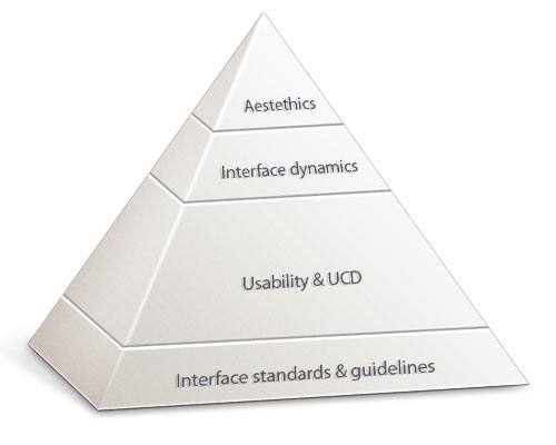
We call it the Visma pyramid of good user experience. At Visma we divide the parts of user experience in four levels. Like with Maslow’s well-known hierarchy of needs, the different steps are interdependent and some steps need to be fulfilled before the other, to fully accomplish good user experience. Let me explain:
1. Interface standards
First we need to take care of the basic needs – to follow standards and conventions. These are based on tradition, knowledge about user-behaviour, and how the human cognitive system works. Just to name a few:
- use affordance (a button should look like and behave like a button)
- navigation should be consistent and predictable
- long lists off data should be grouped
- use recognition rather than recall etc.
2. The usability/UCD-process

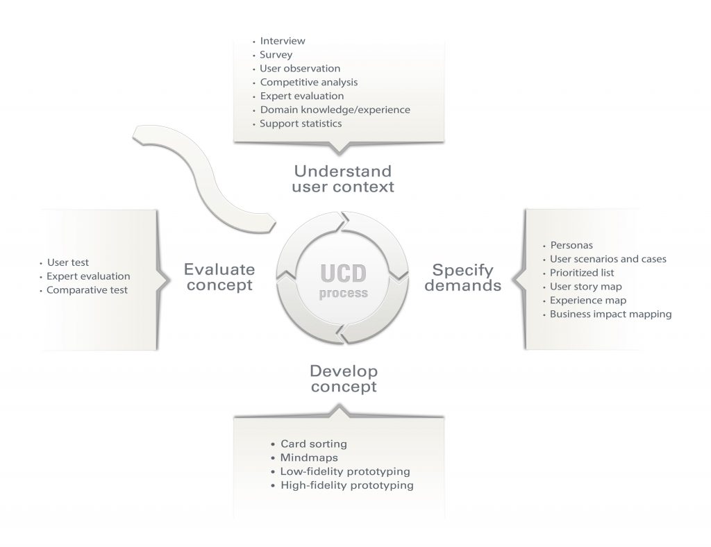
Standards originates from the similarities of humans. But there are many differences among humans. Especially when you consider all the different goals we have with our actions. This is why we also need to apply a user-centered design process in the development of new products. This is quite straight forward – but can be time consuming. But don’t be discouraged, this work is pure investment.
First you need to establish an understanding about the user/s. The better understanding and mapping about your users the better products. Then – do like we’ve done with houses and cars for decades. Prototype and test. Would you ever dream of building a house or car without blueprints, prototypes, wireframes and testing? Probably not.
Actually, you would never be able to sell a car without crash-testing it. We must have the same approach when building software. And, we are not talking about testing if the data is saved in the right database-section but if the user understands what he/she is doing and if she feels ‘in control’. This repays itself many times, by reduced/faster development, decreased support, less bug fixing, less training etc.
This is the most important part of the user experience and the outcome from this work produces what users expects the most – effective and efficient products that give measurable results. The user will end up with the feeling that he/she does not have to think to be able to use the product.
3. Interface dynamics
For quite some time the technology has enabled us to use dynamic interfaces to empower the user. The easiest thing is simple re-sizing of work surfaces, minimize a menu in favour for a larger work surface etc. The latest developments has even further improved the possibilities (multi-touch) and the latest buzz-word is responsive design, interfaces that adapts to different devices. However – don’t mix interface dynamics with “eye-candy animations”. The dynamics needs to be usable. And, if we do it right it does not only empower the user but also captivates him. I don’t know about you, but the first time I used multi-touch I was sold. And, it can even captivate non-humans.
4. Aesthetics
Last but not least. The good things in life is on top of the pyramid and that is the aesthetics, the graphical design. You know, that first impression that lasts. If you can choose you will probably lay your eyes on something pleasantly crafted rather than something stressed or not nurtured. And, even though most people are not conscious about design. They feel it. Instinctively. If you put your heart and mind into creating design with finesse – users will feel it. Like with a car well made, with all the details in place. It’s not a rationale – it’s a feeling. And our goal is to create good feelings for our users. So – one of the laws for the graphical department at Visma is that “you should feel the design – not see it”.
The answer to what good user experience is:
- When you follow standards
- Have a user-centered design process
- Empower the user by using interface dynamics
- Put emphasis on a well-crafted aesthetics
And if you follow these four steps I can bet my right arm that your users will praise and love your software. And, you will build a loyal user base that will become your company’s best ambassador.
Some might say that this is too cost and time-intensive. But actually, it is the other way around. It is too cost and time intensive not doing it. Just look at Apple these days, what is the value of that company? And, I can argue at length that it is their focus and execution on user experience that turned everything around for them. There are no short-cuts when it comes to creating great user experience. You need to walk the walk. And, if you underestimate the user – they will quickly see through your work. If you put your heart into the product and follow the pyramids four sections the design will fall to place quite quickly and gracefully.
This is Vismas model that we base our UX-work on. But it takes more than a model to execute things. It takes people. It takes expertise. And the more in-line development and product management is with the four building blocks of the UX-pyramid the easier it is to reach the goal. At Visma we are working closely and continuously with cultivating this. But more about organizational procedures, awareness, matureness and training related to user experience in a blog post later on…so stay tuned!
How do you create good user experience? Share your insights and experience with us by commenting below!
Further readings
There are an endless amount of blogs and web sites focusing on the subject of user experience. Here are a few – that also can guide you further in the ecosystem of user experience and human computer interaction:
https://www.nngroup.com/ (Nielsen – the godfather of usability)
https://uxmatters.com/ (Far from aesthetically perfect but a good overview of the domain)
https://www.uie.com/
(especially interesting article how usability generates a lot of money)
https://boxesandarrows.com/ (by and for ux-people that offers a lot for non-ux-people)
https://52weeksofux.com/ (thoughtful and partly philosophical)

